I'd take one. As long as they're made in the USA. Also, no rainbows or unicorns.


I'd take one. As long as they're made in the USA. Also, no rainbows or unicorns.

Im in for 2 fezes. Fezi?Originally Posted by Greg


Mock-ups:
Thoughts?
Sorta around sometimes for some of your shitty mod needs.
Those look really sharp BBI's.
Lowercase letters with a hyphen in between would probably be more consistent with the site aesthetic and how people refer to it in posts.

They look a little more structured that I was expecting, but I'll take one of each, or maybe two of the orange. I think having true duplicates is more in line with the purest form of PF philosophy, but I'm not certain of the applicability to headwear.
Concur, and smaller generally, which is not to be ungrateful for the effort youre expending on this; simply to respond to the request for thoughts on the mockup.
Small p goes way below the line, small f sticks way up. That would look strange to me. Maybe I'm missing something here.

I like the hat and structure. I think maybe the p-f logo would look better in lower case too. Below pic so we can just get a visual.
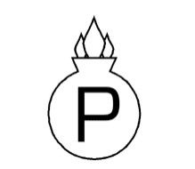
Another option is to use a logo (which may be more expensive). Below is a proof mark used by the Spanish government after 1914 for automatic pistols that passed proof. It is not copyrighted.
Last edited by Paul D; 06-02-2020 at 12:21 AM.
Like that.

